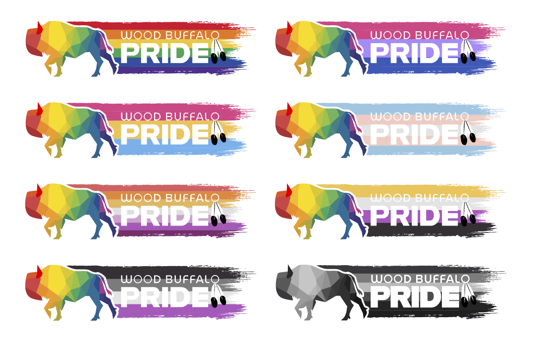
Wood Buffalo Pride
When PrideYMM (now called Wood Buffalo Pride) first reached out to me about making a new logo for them, firstly I was honoured because I feel like this organization has really been there for the LGBTQ+ community in Fort McMurray and the fact that they chose me to help rebrand was a big move. Secondly I was in a bit of a panic, I wanted to make sure I did right by them and really came through with something that worked for their brand. They were not just rebranding their logo, but their name as well. It made sense as YMM is the airport code for Fort mcMurray itself, but they serviced more than just Fort McMurray, they helped folks all over the Wood Buffalo region, which includes many small hamlets.
My first move was looking up a book I had hear about from a friend. It was called Queer X Design: 50 Years of Signs, Symbols, Banners, Logos, and Graphic Art of LGBTQ by Andy Campbell. It was an incredible deep dive into years of Queer art, mostly focusing on the art of protest signs over the years and if you are a designer who is designing for a queer community, I highly recommend it.
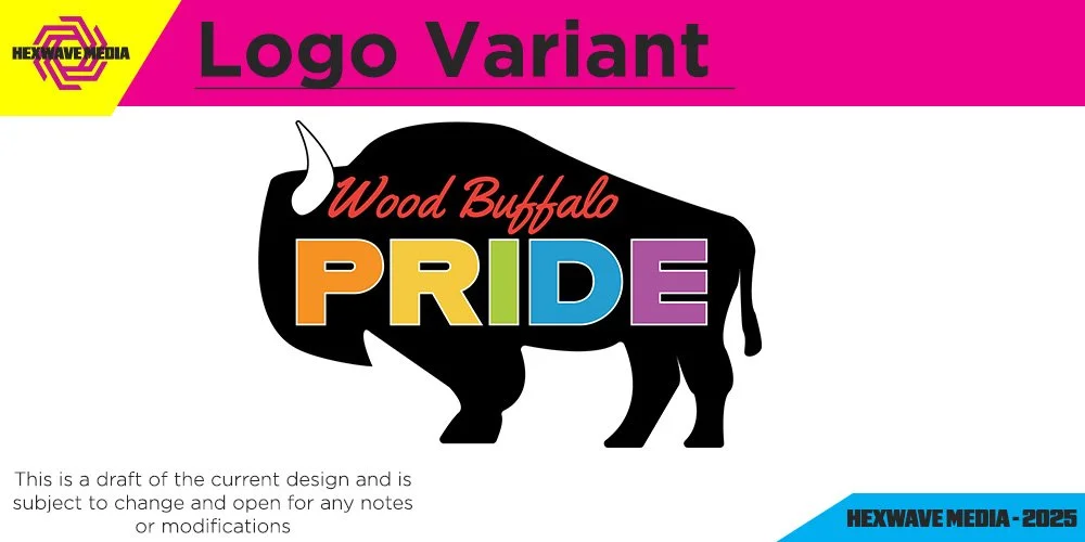
One of the early drafts of the logo was a simple silhouette of a wood buffalo with the organizations name inside. (Thank god we didn’t settle on this one.)
The organization really wanted a wood buffalo in the design and that for me was the hardest part. A wood buffalo is a weird shape, an large amorphis blob of a silhouette from every perspective. In the region of wood buffalo, this animal is used in MANY designs and logos, and I did what I could to try and talk them out of it at the time. However I feel like in the end, having to work with something so strange helped the design and made me a better designer because of it. We went through many iterations, but in the end what I created for them was a wood buffalo in mid-stride with a rainbow trail behind them. It didn’t stop there however, because I have seen that there are many colours and flags that represent the queer community and I suggested we try and represent as many as possible, so for Wood Buffalo Pride, I didn’t just make them one single logo, I made them many.